Tools: Figma, User Research, Adobe XD, Scrum, Miro
Role: UX/UI Designer and Researcher
Team: Zain Beg, Andre Puddie, Carlos Amezian, Ann Hoang, Salahdin Waji
Responsibility: User Research, Usability, Interaction, Visual Design, Prototyping & Testing, Sprints
Abstract:
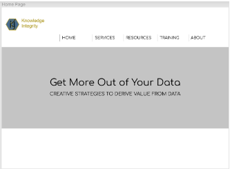
The project ‘Knowledge Integrity’ is a website that belongs to an IT, data management company.
The website provides information about the company as well as the solutions and services they
provide. The website will allow users to access different services, learn more about the work
they do such as data analytics and data management, and help clients create databases.
With the goal being a revision of the Knowledge Integrity platform and expansion of it.
Allowing them to not only connect with more organizations but also create a more fluid
experience for anyone who visits the site while leaving Knowledge Integrity the ability to easily
add new content. But the goals of this changed into simply having a working website with
emphasis on SEO. Leading to the final goal being a Knowledge Integrity Website that is able to
bring up more search results on google.
Methods:
Brainstorm
We first started off with getting the client WordPress account and reviewing the competitors
websites. Before listing the strengths and weaknesses of the websites, what the client needs and
what needs to be updated on the website.
We first started off with getting the client WordPress account and reviewing the competitors
websites. Before listing the strengths and weaknesses of the websites, what the client needs and
what needs to be updated on the website.
Client Account
Our team member Zain emailed our client about giving us access to WordPress which is the
main domain for the Knowledge Integrity site. We didn’t place an end date for this because it
relied mostly on the Client’s availability and when they can provide us with the account.
Fortunately, it didn’t take long for him to respond, leading us to gain a dummy account.
Website Reviews:
Strengths:
● On the Global Data Strategy website, we noted how visually pleasing and easy the
navigate this website was on the home page. They incorporated an update feature that
posts their recent work or webinar on the home page.
● On the All-Checklist Six Critical plan, we noted how easy and big the fonts were.
Making it usability friendly from how easy to read and follow for any visitor or those
who are just skimming through. They also have a sign-up page that is easy and on the
home screen.
● We liked how Mcknightcg pages were organized neatly with a quick summary and
descriptions of what they can do. We liked how they had their clients shown with some
reviews and testimonials to better their own credibility. We also noted how each of their
links was working and how it took us to another page that expands the topic shown
before.
● Datasource Consulting is similar to the Mcknightcg as both are organized and formatted
into sections with easy-to-read headings. Datasource Consulting has a nice Gif- that fades
into the background with a statement and subtext that stood out to us. We liked how they
put a quick summary of their services on the first page with an icon above it to
distinguish them. We liked how instead of having an About Page, it was more of a Who
We Are header that shows - Who they worked with, What they are About, the people on
their Team, What makes them different from the others, and how they do it. The timeline
added below was an interesting concept and something we might think about adding or
bringing up with the Client.
● Data Quality Book has a good information architecture and it doesn't require a lot of
effort to navigate the site. The site also makes it easy to find their products as it’s on the
first page and on the side. The website also refers to Amazon to purchase the product.
● Arch Checklist website seems to be the most alive and community inspiring. It has
subtitles “New!” to alert any user that something new was updated. Posts for events are
organized by dates with their own visuals to tell them apart.
Weakness:
● The Global Data Strategy website lacks a quick description of what its services provide.
Requiring one to click on it to see what it’s about, leads to time wasted if it isn’t the
product they're looking for.
● Unlike Datasource consulting, we shouldn’t value aesthetics over efficiency. We don’t
need a GIF or picture to stand out above the service we provide.
● Arch Checklist fails in how cluttered it’s and how too many things appear on the page.
While this problem doesn't appear on every page, it does make it difficult to take in all of
the information provided.
Client Needs
● Redoing the home page with a welcome description, links and social media.
● Create an enterprise data, Data Governance and Quality, Master Data Management,
Business Intelligence and Analytics, and Training Page.
● Adding a payment option where the host can put their products behind a pay firewall.
● Instructions and adding easy ways to add artifacts, products and documents.
● A potent service for filling out an assessment survey that can then be reviewed
● Links that will take visitors to another window when they click on a document on the
website but make it so it doesn't force them to leave the website.
● Having instructions on how to archive the design files, in case the client wants to store it
away or move to another hosting site. Also have instructions for how to move the files to
another hosting site.
Update or needs to be fixed
● The Color would need to be changed, to make it more pleasing to look at and read
through.
● The Font for the services summary will need to be made bigger, as they are small and
would make it hard to read.
● Some links will need to be fixed - like the services that don’t take you to said page when
clicked on
● Re-format some of the pages on the website, like the Resource one that's and is out of
date.
Project Plan
There are plenty of ideas we could implement after browsing through these websites. All while
being careful to look out for the negatives of those and trying to solely implement the best ones.
So the plan is to start taking areas that these Websites did well and begin implementing in the
sketching stage. The sketching stages would be similar to a wireframe of the design but also a
prototype of the design itself.
We plan to make two designs, each based on a different perspective or website idea. Then we
will either choose one or take aspects of the different designs and put them together before
showing the Client. Depending on the Client words, we will either continue or go back to the
designing board. Once we have a sketch for each page through Figma - a graphics editor and
prototyping tool used for web-based designs such as websites. We will then start creating the
pages on Wix based on the Figma designs.
After doing this, we will showcase the website to the client for more feedback. Then depending
on their response, we will continue editing the site or start to add the documentation they wanted
on it.
on their response, we will continue editing the site or start to add the documentation they wanted
on it.
Sprints
For our website redesign project, we used sprints to split the work up into different sections. For example, my team had four months to work on the project, so we split it up into eight two-week sprints. During sprint one, our goals included WordPress installation, sitemap creation, and content interviews/research. We had weekly meetings on Tuesdays to discuss what we’ve accomplished since the last meeting, what we’ll work on before the next meeting, and if any obstacles are standing in their way.
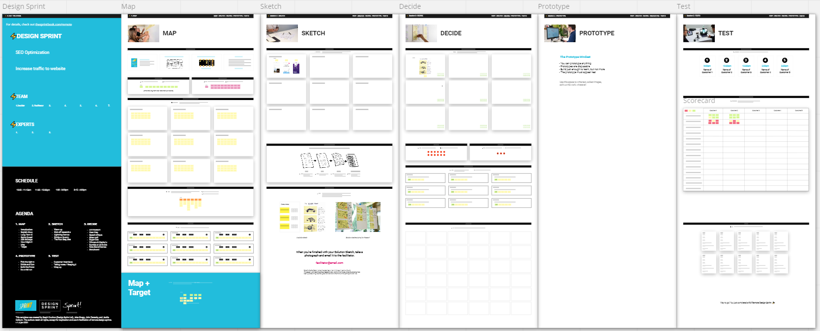
Wireframes
We designed the low-fidelity wireframes to get an idea of what the website is going to look like
on the platform. With two different designs that were framed based on the competitive analysis we completed.
on the platform. With two different designs that were framed based on the competitive analysis we completed.
Recommendations:
The website has been updated and designs have changed. Alongside it being a working and
running website but it could be improved with more SEO optimization and adding a Survey.
running website but it could be improved with more SEO optimization and adding a Survey.
SEO Optimization:
At the moment, only the basic SEO has been done for the website using Wix SEO Guide. The
next step may be adding some backlinks, getting other websites or previous clients to sponsor
and better keywords for improving the website results.
At the moment, only the basic SEO has been done for the website using Wix SEO Guide. The
next step may be adding some backlinks, getting other websites or previous clients to sponsor
and better keywords for improving the website results.
Survey Creation:
A survey for the website products and surveys, which makes a new tab while staying on the
current website.
A survey for the website products and surveys, which makes a new tab while staying on the
current website.
Conclusions:
Overall this project was a good learning and hand on experience for website designing and Ux
Design in general. It taught us how important time management was, the need to make use of every client meeting and how valuable it’s to think-outside the box. Some future that could be
done is further designs when the documents and links are added alongside any SEO
improvement.
Design in general. It taught us how important time management was, the need to make use of every client meeting and how valuable it’s to think-outside the box. Some future that could be
done is further designs when the documents and links are added alongside any SEO
improvement.
Final Product:
Website: https://KnowledgeIntegrity.com
Figma Designs: https://www.figma.com/file/HrLxGIrg4BRdSz9XEiAES9/Website-Redesign